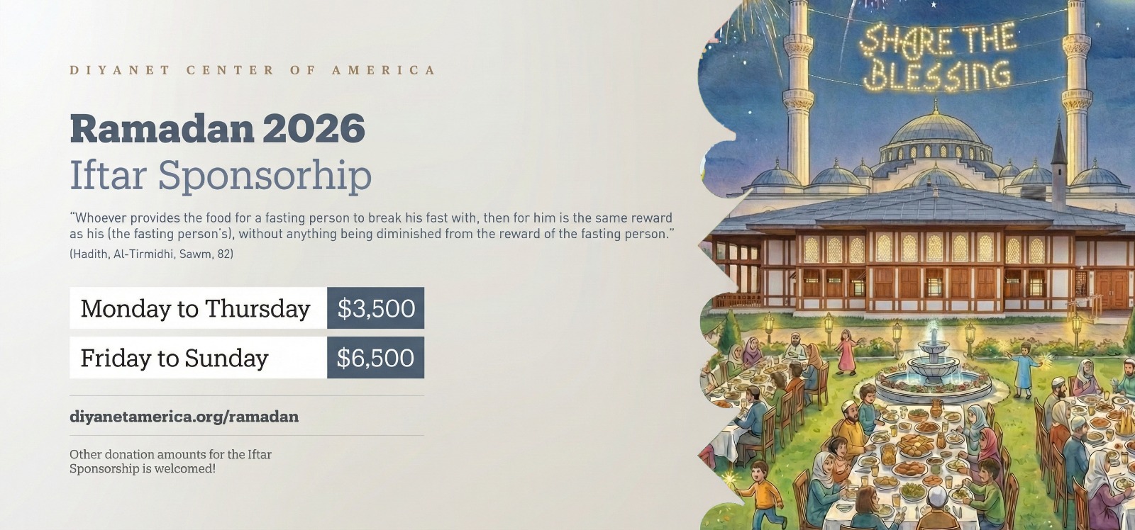
.elementor-17852 .elementor-element.elementor-element-ca375f8{margin-top:0px;margin-bottom:0px;}.elementor-17852 .elementor-element.elementor-element-c400fbb{width:var( --container-widget-width, 100.225% );max-width:100.225%;--container-widget-width:100.225%;--container-widget-flex-grow:0;}.elementor-17852 .elementor-element.elementor-element-b876e1b > .elementor-widget-container{margin:-130px 0px 0px 0px;}/* Start custom CSS for html, class: .elementor-element-c400fbb */@media (max-width: 600px) {
        .dca-modal-content {
            padding: 25px 15px; /* Reduced from 50px */
            width: 92%;
        }
        .dca-close-btn {
            top: 10px; /* Moved closer to corner */
            right: 15px;
        }
    }/* End custom CSS */
/* Start custom CSS for html, class: .elementor-element-b876e1b */<!DOCTYPE html>
<html lang="en">
<head>
<meta charset="UTF-8">
<meta name="viewport" content="width=device-width, initial-scale=1.0, maximum-scale=1.0, user-scalable=no">
<title>Ramadan at DCA - 2026</title>

<link rel="stylesheet" href="https://cdnjs.cloudflare.com/ajax/libs/font-awesome/6.4.0/css/all.min.css">
<link rel="preconnect" href="https://fonts.googleapis.com">
<link rel="preconnect" href="https://fonts.gstatic.com" crossorigin>
<link href="https://fonts.googleapis.com/css2?family=Inter:wght@400;500;600&family=Montserrat:wght@500;700;800&display=swap" rel="stylesheet">

<style>
    /* =========================================
       1. DESIGN SYSTEM & VARIABLES
       ========================================= */
    :root {
        --primary-navy: #0C1C2C;
        --accent-red: #E31E24;
        --accent-gold: #C5A065;
        --bg-warm: #fdfbf7;
        --bg-warm-gradient: linear-gradient(135deg, #fdfbf7 0%, #f4f1ea 100%);
        --text-dark: #1a1a1a;
        --text-grey: #4a4a4a;
        
        --shadow-sm: 0 4px 6px -1px rgba(0, 0, 0, 0.05);
        --shadow-md: 0 10px 30px -5px rgba(0, 0, 0, 0.08);
        --shadow-lg: 0 25px 50px -12px rgba(0, 0, 0, 0.15);
        
        --section-padding-desktop: 100px 5%;
        --section-padding-mobile: 60px 20px;
    }

    /* =========================================
       2. ANIMATIONS
       ========================================= */
    /* Heartbeat for Buttons */
    @keyframes btnPulse {
        0% { transform: scale(1); box-shadow: 0 4px 15px rgba(227, 30, 36, 0.3); }
        50% { transform: scale(1.05); box-shadow: 0 15px 35px rgba(227, 30, 36, 0.5); }
        100% { transform: scale(1); box-shadow: 0 4px 15px rgba(227, 30, 36, 0.3); }
    }

    /* Phone Floating */
    @keyframes floatDevice {
        0% { transform: translateY(0px) rotate(-3deg); }
        50% { transform: translateY(-20px) rotate(-2deg); }
        100% { transform: translateY(0px) rotate(-3deg); }
    }

    /* Phone Shadow Breathing */
    @keyframes shadowBreathe {
        0% { opacity: 0.2; transform: scale(1); filter: blur(20px); }
        50% { opacity: 0.1; transform: scale(0.9); filter: blur(25px); }
        100% { opacity: 0.2; transform: scale(1); filter: blur(20px); }
    }

    /* Phone Screen Glint */
    @keyframes glassSheen {
        0% { left: -150%; opacity: 0; }
        50% { opacity: 0.1; }
        100% { left: 150%; opacity: 0; }
    }

    /* Scroll Reveal Fade In */
    .reveal-on-scroll {
        opacity: 0;
        transform: translateY(30px);
        transition: all 0.8s ease-out;
    }
    .reveal-on-scroll.is-visible {
        opacity: 1;
        transform: translateY(0);
    }

    /* =========================================
       3. GLOBAL RESET & UTILITIES
       ========================================= */
    * { margin: 0; padding: 0; box-sizing: border-box; }
    html, body { margin: 0 !important; padding: 0 !important; width: 100%; overflow-x: hidden; }
    
    body {
        font-family: 'Inter', sans-serif;
        color: var(--text-dark);
        background-color: var(--bg-warm);
        line-height: 1.6;
        -webkit-font-smoothing: antialiased;
    }

    h1, h2, h3, h4, h5, h6 { font-family: 'Montserrat', sans-serif; line-height: 1.2; }

    /* Custom Scrollbar */
    ::-webkit-scrollbar { width: 12px; }
    ::-webkit-scrollbar-track { background: var(--bg-warm); }
    ::-webkit-scrollbar-thumb { background: var(--accent-gold); border-radius: 6px; border: 3px solid var(--bg-warm); }
    ::-webkit-scrollbar-thumb:hover { background: var(--primary-navy); }

    /* Custom Selection */
    ::selection { background: var(--accent-gold); color: white; }

    .container { max-width: 1200px; margin: 0 auto; width: 100%; }

    /* Button Styles */
    .btn {
        display: inline-block; padding: 16px 36px;
        font-family: 'Montserrat', sans-serif; font-weight: 700; font-size: 0.95rem;
        text-transform: uppercase; border-radius: 6px; text-decoration: none;
        transition: all 0.3s cubic-bezier(0.4, 0, 0.2, 1);
        letter-spacing: 0.5px; border: none; cursor: pointer;
        position: relative; z-index: 1; overflow: hidden;
    }

    /* Luxury Shine Effect on Hover */
    .btn::after {
        content: ''; position: absolute; top: 0; left: -100%; width: 50%; height: 100%;
        background: linear-gradient(to right, rgba(255,255,255,0) 0%, rgba(255,255,255,0.3) 50%, rgba(255,255,255,0) 100%);
        transform: skewX(-25deg); transition: none;
    }
    .btn:hover::after { transition: left 0.7s ease-in-out; left: 150%; }

    .btn-red { background-color: var(--accent-red); color: white; box-shadow: 0 4px 15px rgba(227, 30, 36, 0.3); }
    .btn-red:hover { background-color: #c41217; transform: translateY(-2px); }

    .btn-gold { background-color: var(--accent-gold); color: white; }
    .btn-gold:hover { background-color: #b08d55; transform: translateY(-2px); }

    .btn-insta {
        background: linear-gradient(45deg, #f09433 0%, #e6683c 25%, #dc2743 50%, #cc2366 75%, #bc1888 100%);
        color: white; box-shadow: 0 10px 20px rgba(220, 39, 67, 0.25);
    }
    .btn-insta:hover { transform: translateY(-3px); box-shadow: 0 15px 30px rgba(220, 39, 67, 0.4); }

    .btn-pulse { animation: btnPulse 2s infinite ease-in-out; }
    .btn-pulse:hover { animation: none; transform: scale(1.05); }

    /* =========================================
       SECTION 1: HERO
       ========================================= */
    .hero-section {
        position: relative; width: 100%; min-height: 100vh; max-height: 800px;
        display: flex; align-items: center;
        background-image: url('https://diyanetamerica.org/wp-content/uploads/2014/11/diyanet-center-mosque-02.jpg');
        background-size: cover; background-position: center; background-repeat: no-repeat;
    }
    .hero-overlay {
        position: absolute; inset: 0; z-index: 1;
        background: linear-gradient(90deg, rgba(12,28,44,0.95) 0%, rgba(12,28,44,0.6) 40%, rgba(12,28,44,0.1) 100%);
    }
    .hero-content {
        position: relative; z-index: 2; max-width: 1200px; margin: 0 auto;
        padding: 0 40px; width: 100%; color: white;
    }
    .hero-title {
        font-size: clamp(2.8rem, 5vw, 4rem); font-weight: 800; margin-bottom: 25px;
        line-height: 1.1; max-width: 600px; text-shadow: 0 2px 4px rgba(0,0,0,0.3);
    }
    .hero-text {
        font-size: clamp(1.1rem, 2vw, 1.25rem); line-height: 1.6; margin-bottom: 40px;
        color: #f0f0f0; max-width: 600px; text-shadow: 0 1px 2px rgba(0,0,0,0.3);
    }
    @media (max-width: 768px) {
        .hero-section { align-items: flex-start; background-position: center; }
        .hero-overlay { background: linear-gradient(180deg, rgba(12,28,44,1) 0%, rgba(12,28,44,0.8) 40%, rgba(12,28,44,0) 100%); }
        .hero-content { padding: 120px 25px 0 25px; text-align: center; }
        .hero-title, .hero-text { max-width: 100%; margin-left: auto; margin-right: auto; }
        .btn { width: 100%; }
    }

    /* =========================================
       SECTION 2: DONATION
       ========================================= */
    .donation-section {
        padding: var(--section-padding-desktop); background: var(--bg-warm-gradient);
        display: flex; flex-direction: column; gap: 100px; align-items: center;
        border-bottom: 1px solid #e0d8c3;
    }
    .split-row { max-width: 1400px; width: 100%; display: flex; align-items: center; gap: 60px; }
    .split-row.reverse { flex-direction: row-reverse; }
    
    .split-image { flex: 1.5; position: relative; }
    .flyer-img {
        width: 100%; height: auto; border-radius: 12px;
        box-shadow: var(--shadow-lg); border: 1px solid rgba(0,0,0,0.05);
        display: block; transition: transform 0.3s ease;
    }
    .flyer-img:hover { transform: scale(1.01); }

    .split-content { flex: 1; text-align: left; }
    .section-label {
        font-family: 'Georgia', serif; font-size: 1.2rem; color: var(--accent-gold);
        font-style: italic; margin-bottom: 10px; display: block;
        text-transform: uppercase; letter-spacing: 1px;
    }
    .section-title {
        font-size: 2.8rem; color: var(--primary-navy); font-weight: 800;
        line-height: 1.1; margin-bottom: 20px;
    }
    .divider { width: 50px; height: 3px; background-color: var(--accent-red); margin-bottom: 25px; }
    .section-desc { font-size: 1rem; line-height: 1.6; color: var(--text-grey); margin-bottom: 30px; }
    .hadith-source {
        display: block; margin-top: 10px; font-weight: 700;
        color: var(--primary-navy); font-size: 0.85rem; text-transform: uppercase;
    }

    @media (max-width: 1100px) {
        .donation-section { gap: 60px; padding: var(--section-padding-mobile); }
        .split-row, .split-row.reverse { flex-direction: column; gap: 30px; }
        .split-image, .split-content { flex: auto; width: 100%; text-align: center; }
        .divider { margin: 0 auto 25px auto; }
        .section-title { font-size: 2.2rem; }
    }

    /* =========================================
       SECTION 3: RESOURCES
       ========================================= */
    .resources-section {
        padding: var(--section-padding-desktop);
        background: linear-gradient(135deg, #e6dec8 0%, #d4c5a6 100%);
    }
    .resources-header { text-align: center; margin-bottom: 50px; }
    .resources-header h2 {
        color: var(--primary-navy); font-size: 3rem; font-weight: 800;
        text-transform: uppercase; letter-spacing: 1px; margin: 0;
    }
    .resources-grid {
        display: grid; grid-template-columns: repeat(3, 1fr);
        gap: 20px; max-width: 1100px; margin: 0 auto;
    }
    .resource-card {
        background-color: #ffffff; padding: 35px 25px; border-radius: 6px;
        text-align: center; display: flex; flex-direction: column;
        align-items: center; justify-content: space-between;
        min-height: 280px; box-shadow: var(--shadow-sm);
        transition: transform 0.3s ease, box-shadow 0.3s ease;
    }
    .resource-card:hover { transform: translateY(-5px); box-shadow: var(--shadow-md); }
    
    .card-icon {
        font-size: 3.5rem; color: var(--accent-gold); margin-bottom: 20px;
        filter: drop-shadow(0 2px 3px rgba(197, 160, 101, 0.2));
    }
    .card-heading {
        color: var(--primary-navy); font-size: 1.1rem; font-weight: 800;
        text-transform: uppercase; line-height: 1.3; margin-bottom: 25px;
        max-width: 260px; flex-grow: 1; display: flex; align-items: center; justify-content: center;
    }
    .btn-full { width: 100%; padding: 15px 0; }

    @media (max-width: 900px) {
        .resources-grid { grid-template-columns: repeat(2, 1fr); max-width: 700px; }
        .resources-section { padding: var(--section-padding-mobile); }
    }
    @media (max-width: 600px) {
        .resources-grid { grid-template-columns: 1fr; }
        .resources-header h2 { font-size: 2.2rem; }
    }

    /* =========================================
       SECTION 4: EVENTS
       ========================================= */
    .events-section { width: 100%; padding: 80px 0; background: var(--bg-warm-gradient); }
    .events-container { width: 100%; max-width: 100%; margin: 0; padding: 0 20px; }

    /* =========================================
       SECTION 5: GUIDELINES
       ========================================= */
    .guidelines-section { padding: var(--section-padding-desktop); background-color: #f8f9fa; }
    .guidelines-header { text-align: center; margin-bottom: 60px; }
    .guidelines-header h2 {
        font-size: 3rem; font-weight: 800; color: var(--primary-navy);
        margin-bottom: 15px; text-transform: uppercase;
    }
    .guidelines-header p {
        font-family: 'Georgia', serif; font-size: 1.2rem; color: #555;
        font-style: italic; max-width: 700px; margin: 0 auto;
    }
    .guidelines-grid {
        display: grid; grid-template-columns: 1fr 1fr; gap: 40px;
        max-width: 1200px; margin: 0 auto;
    }
    .guide-card {
        background: #ffffff; border-radius: 12px; padding: 50px 40px;
        box-shadow: var(--shadow-sm); border-top: 5px solid var(--accent-gold);
    }
    .guide-head { margin-bottom: 30px; padding-bottom: 20px; border-bottom: 1px solid #eee; }
    .guide-head h3 { font-size: 1.8rem; font-weight: 800; color: var(--primary-navy); }
    .guide-section {
        font-size: 1.2rem; font-weight: 700; color: var(--accent-gold);
        text-transform: uppercase; margin-top: 30px; margin-bottom: 15px;
        display: block; letter-spacing: 1px;
    }
    .guide-list { list-style: none; padding: 0; margin: 0; }
    .guide-item {
        display: flex; align-items: flex-start; gap: 15px;
        margin-bottom: 15px; font-size: 1rem; line-height: 1.6; color: #444;
    }
    .guide-item strong { color: var(--primary-navy); font-weight: 700; }
    .icon-check { color: #2e7d32; font-size: 1.1rem; margin-top: 3px; flex-shrink: 0; }
    .icon-cross { color: var(--accent-red); font-size: 1.1rem; margin-top: 3px; flex-shrink: 0; }

    @media (max-width: 900px) {
        .guidelines-section { padding: var(--section-padding-mobile); }
        .guidelines-header h2 { font-size: 2.2rem; }
        .guidelines-grid { grid-template-columns: 1fr; gap: 30px; }
        .guide-card { padding: 30px 20px; }
    }

    /* =========================================
       SECTION 6: SOCIAL (With Animations)
       ========================================= */
    .social-section {
        padding: var(--section-padding-desktop); background: var(--bg-warm-gradient);
        display: flex; justify-content: center; align-items: center;
        overflow: hidden; position: relative;
    }
    .glow-circle {
        position: absolute; width: 600px; height: 600px;
        background: radial-gradient(circle, rgba(197, 160, 101, 0.15) 0%, rgba(255, 255, 255, 0) 70%);
        border-radius: 50%; right: 10%; top: 50%; transform: translateY(-50%); z-index: 0;
    }
    .social-container {
        max-width: 1200px; width: 100%; display: flex; align-items: center;
        justify-content: space-between; gap: 60px; position: relative; z-index: 1;
    }
    .social-text { flex: 1; max-width: 600px; }
    .social-tag {
        display: inline-block; background-color: rgba(197, 160, 101, 0.1);
        color: var(--accent-gold); padding: 8px 16px; border-radius: 30px;
        font-size: 0.9rem; font-weight: 700; text-transform: uppercase;
        letter-spacing: 1px; margin-bottom: 25px; border: 1px solid rgba(197, 160, 101, 0.3);
    }
    .social-headline {
        font-size: 3.5rem; font-weight: 800; color: var(--primary-navy);
        line-height: 1.1; margin-bottom: 20px;
    }
    .social-desc {
        font-family: 'Segoe UI', sans-serif; font-size: 1.15rem;
        line-height: 1.7; color: #555; margin-bottom: 40px;
    }
    .stats-row {
        display: flex; gap: 40px; margin-bottom: 40px;
        border-top: 1px solid #e0d8c3; padding-top: 30px;
    }
    .stat-item h4 { font-size: 1.8rem; color: var(--primary-navy); margin-bottom: 5px; font-weight: 700; }
    .stat-item p { font-size: 0.9rem; color: #888; text-transform: uppercase; letter-spacing: 1px; }

    /* Phone Mockup Animations */
    .phone-wrapper {
        flex: 1; display: flex; justify-content: center; perspective: 1000px;
        position: relative; z-index: 2;
    }
    /* Shadow Floor */
    .phone-wrapper::after {
        content: ''; position: absolute; bottom: -40px; left: 20%; width: 60%; height: 20px;
        background: black; border-radius: 50%; z-index: -1;
        animation: shadowBreathe 6s ease-in-out infinite;
    }
    .phone-frame {
        width: 300px; height: 600px; background-color: #000;
        border-radius: 40px; padding: 12px; box-shadow: 0 20px 50px rgba(0,0,0,0.2);
        border: 4px solid #333; position: relative;
        will-change: transform;
        animation: floatDevice 6s ease-in-out infinite;
    }
    .phone-screen {
        width: 100%; height: 100%; background-color: #000;
        border-radius: 30px; overflow: hidden; position: relative;
    }
    /* Screen Glint */
    .phone-screen::after {
        content: ''; position: absolute; top: 0; left: -150%; width: 50%; height: 100%;
        background: linear-gradient(to right, rgba(255,255,255,0) 0%, rgba(255,255,255,0.15) 50%, rgba(255,255,255,0) 100%);
        transform: skewX(-25deg); pointer-events: none;
        animation: glassSheen 5s infinite cubic-bezier(0.4, 0.0, 0.2, 1);
    }
    .phone-img { width: 100%; height: 100%; object-fit: cover; }
    .phone-notch {
        width: 120px; height: 25px; background-color: #000;
        position: absolute; top: 0; left: 50%; transform: translateX(-50%);
        border-radius: 0 0 15px 15px; z-index: 10;
    }

    @media (max-width: 900px) {
        .social-section { padding: var(--section-padding-mobile); }
        .social-container { flex-direction: column-reverse; text-align: center; gap: 40px; }
        .social-text { max-width: 100%; }
        .stats-row { justify-content: center; }
        .social-headline { font-size: 2.5rem; }
        .glow-circle { display: none; }
        
        .phone-frame {
            width: 260px; height: 520px;
            animation: none; /* Disable full float on mobile for stability */
            transform: translateY(0);
        }
        .phone-wrapper::after { display: none; }
    }

    /* =========================================
       MODALS
       ========================================= */
    .modal-overlay {
        display: none; position: fixed; z-index: 9999;
        left: 0; top: 0; width: 100%; height: 100%;
        background-color: rgba(12, 28, 44, 0.9);
        backdrop-filter: blur(8px);
        align-items: center; justify-content: center;
    }
    .modal-content {
        background-color: #fff; padding: 50px;
        border-radius: 12px; width: 95%; max-width: 650px;
        position: relative; box-shadow: var(--shadow-lg);
        max-height: 90vh; overflow-y: auto;
        animation: floatDevice 0.5s ease-out forwards; /* Slight popup anim */
        animation-iteration-count: 1;
    }
    .close-btn {
        position: absolute; top: 20px; right: 25px;
        font-size: 2.5rem; color: #888; cursor: pointer; line-height: 1;
    }
    @media (max-width: 600px) {
        .modal-content { padding: 25px 15px; width: 92%; }
        .close-btn { top: 10px; right: 15px; font-size: 2rem; }
    }
</style>
</head>
<body>

    <section class="hero-section reveal-on-scroll">
        <div class="hero-overlay"></div>
        <div class="hero-content">
            <h1 class="hero-title">Ramadan at DCA</h1>
            <p class="hero-text">
                Experience the blessings of the holy month with the Diyanet Center of America. 
                From community iftars to spiritual resources, see how the DCA is working to bring 
                our community together.
            </p>
            <a href="https://diyanetamerica.org/donations/" class="btn btn-red btn-pulse" target="_blank">
                SUPPORT DCA
            </a>
        </div>
    </section>

    <section class="donation-section reveal-on-scroll">
        <div class="container split-row">
            <div class="split-image">
                <img src="https://diyanetamerica.org/wp-content/uploads/2026/01/WhatsApp-Image-2026-01-11-at-10.15.56-PM.jpeg" alt="Iftar Sponsorship" class="flyer-img">
            </div>
            <div class="split-content">
                <span class="section-label">Share the Blessing</span>
                <h2 class="section-title">Ramadan 2026<br>Iftar Sponsorship</h2>
                <div class="divider"></div>
                <p class="section-desc">
                    "Whoever provides the food for a fasting person to break his fast with, then for him is the same reward as his (the fasting person's), without anything being diminished from the reward of the fasting person."
                    <span class="hadith-source">— (Hadith, Al-Tirmidhi, Sawm, 82)</span>
                </p>
                <button class="btn btn-red btn-pulse" onclick="openModal('modalIftar')">Sponsor an Iftar</button>
            </div>
        </div>

        <div class="container split-row reverse">
            <div class="split-image">
                <img src="https://diyanetamerica.org/wp-content/uploads/2025/02/Social_21.png" alt="Zakat Al-Fitr Flyer" class="flyer-img">
            </div>
            <div class="split-content">
                <span class="section-label">Fitr Sadakasi ($15/Person)</span>
                <h2 class="section-title">Zakat Al-Fitr<br>Donation</h2>
                <div class="divider"></div>
                <p class="section-desc">
                    Take this opportunity to purify your fast by giving more and supporting those in need. Zakat Al-Fitr is a way to cleanse your Ramadan and share the joy of Eid with the less fortunate.
                    <span class="hadith-source">Recommended: $15 Per Person</span>
                </p>
                <button class="btn btn-red btn-pulse" onclick="openModal('modalZakat')">Pay Zakat Al-Fitr</button>
            </div>
        </div>
    </section>

    <section class="resources-section reveal-on-scroll">
        <div class="resources-header">
            <h2>Ramadan Resources at DCA</h2>
        </div>
        <div class="resources-grid">
            <div class="resource-card">
                <div class="card-icon"><i class="fa-regular fa-calendar-check"></i></div>
                <h3 class="card-heading">Ramadan Prayer<br>Calendar</h3>
                <a href="#" class="btn btn-gold btn-full">Download Now</a>
            </div>
            <div class="resource-card">
                <div class="card-icon"><i class="fa-solid fa-hand-holding-heart"></i></div>
                <h3 class="card-heading">Sadaqah<br>Donations</h3>
                <a href="https://diyanetamerica.org/donations/" class="btn btn-red btn-full btn-pulse">Donate Now</a>
            </div>
            <div class="resource-card">
                <div class="card-icon"><i class="fa-solid fa-mosque"></i></div>
                <h3 class="card-heading">Taraweeh<br>Schedules</h3>
                <a href="#" class="btn btn-gold btn-full" style="opacity:0.6; cursor:default;">TBD</a>
            </div>
            <div class="resource-card">
                <div class="card-icon"><i class="fa-solid fa-box-open"></i></div>
                <h3 class="card-heading">Zakat-ul-Fitr &<br>Fidaya Guidance</h3>
                <a href="#" class="btn btn-gold btn-full">Learn More</a>
            </div>
            <div class="resource-card">
                <div class="card-icon"><i class="fa-solid fa-users-rays"></i></div>
                <h3 class="card-heading">Community<br>Events</h3>
                <a href="#" class="btn btn-gold btn-full">View Calendar</a>
            </div>
            <div class="resource-card">
                <div class="card-icon"><i class="fa-solid fa-cloud-moon"></i></div>
                <h3 class="card-heading">Iftar and Suhoor<br>Times</h3>
                <a href="#" class="btn btn-gold btn-full" style="opacity:0.6; cursor:default;">TBD</a>
            </div>
            <div class="resource-card">
                <div class="card-icon"><i class="fa-solid fa-utensils"></i></div>
                <h3 class="card-heading">Community Iftar<br>Sponsorship</h3>
                <a href="https://diyanetamerica.org/donations/" class="btn btn-red btn-full btn-pulse">Donate Now</a>
            </div>
            <div class="resource-card">
                <div class="card-icon"><i class="fa-solid fa-briefcase"></i></div>
                <h3 class="card-heading">Ramadan Job<br>Opportunities</h3>
                <a href="#" class="btn btn-gold btn-full">Apply Now</a>
            </div>
            <div class="resource-card">
                <div class="card-icon"><i class="fa-solid fa-hands-holding-child"></i></div>
                <h3 class="card-heading">Support DCA<br>Youth</h3>
                <a href="https://diyanetamerica.org/donations/" class="btn btn-red btn-full btn-pulse">Donate Now</a>
            </div>
        </div>
    </section>

    <section class="events-section reveal-on-scroll">
        <div class="events-container">
            [emp_home_ramadan_events]
        </div>
    </section>

    <section class="guidelines-section reveal-on-scroll">
        <div class="guidelines-header">
            <h2>Ramadan Guidelines</h2>
            <p>"May Allah accept your fasting, prayers, and good deeds. By following these guidelines, you contribute to a peaceful and blessed Ramadan experience for all."</p>
        </div>
        <div class="guidelines-grid">
            <div class="guide-card">
                <div class="guide-head"><h3>Facility & Iftar Rules</h3></div>
                
                <span class="guide-section">Masjid Guideline</span>
                <ul class="guide-list">
                    <li class="guide-item"><i class="fa-solid fa-circle-xmark icon-cross"></i> <span><strong>No Eating or Drinking</strong> inside the Masjid at any time.</span></li>
                    <li class="guide-item"><i class="fa-solid fa-circle-xmark icon-cross"></i> <span><strong>No Reserving Spots</strong> by leaving rugs after Maghrib for Taraweeh.</span></li>
                    <li class="guide-item"><i class="fa-solid fa-circle-xmark icon-cross"></i> <span><strong>No Entry if Full.</strong> Respect capacity limits and pray in the designated musalla areas.</span></li>
                </ul>

                <span class="guide-section">Iftar Guideline</span>
                <ul class="guide-list">
                    <li class="guide-item"><i class="fa-solid fa-circle-xmark icon-cross"></i> <span><strong>No Table Reservations.</strong> Seating is first-come, first-served.</span></li>
                    <li class="guide-item"><i class="fa-solid fa-circle-xmark icon-cross"></i> <span><strong>No Moving Tables/Chairs</strong> as they are set for capacity.</span></li>
                    <li class="guide-item"><i class="fa-solid fa-circle-xmark icon-cross"></i> <span><strong>No Eating</strong> in prayer areas or buildings other than the restaurant/tent.</span></li>
                    <li class="guide-item"><i class="fa-solid fa-circle-xmark icon-cross"></i> <span><strong>No Leaving Trash.</strong> Please use disposal bins provided.</span></li>
                    <li class="guide-item"><i class="fa-solid fa-circle-check icon-check"></i> <span><strong>Prioritize Seating</strong> for the elderly.</span></li>
                    <li class="guide-item"><i class="fa-solid fa-circle-check icon-check"></i> <span><strong>Perform Wudu at home</strong> when possible to keep restrooms clean.</span></li>
                </ul>
            </div>

            <div class="guide-card">
                <div class="guide-head"><h3>Children & Family</h3></div>
                
                <span class="guide-section">Children 0-3 Years</span>
                <ul class="guide-list">
                    <li class="guide-item"><i class="fa-solid fa-circle-check icon-check"></i> <span><strong>Parents are Advised</strong> to pray Taraweeh at home if child may cause distractions.</span></li>
                    <li class="guide-item"><i class="fa-solid fa-circle-check icon-check"></i> <span>Consider <strong>Alternative Childcare</strong> for long prayers.</span></li>
                    <li class="guide-item"><i class="fa-solid fa-circle-xmark icon-cross"></i> <span><strong>No Excessive Noise.</strong> The Masjid is a place of reflection.</span></li>
                </ul>

                <span class="guide-section">Children 3-7 Years</span>
                <ul class="guide-list">
                    <li class="guide-item"><i class="fa-solid fa-circle-check icon-check"></i> <span><strong>Childcare Available</strong> at the lower level during prayer times.</span></li>
                    <li class="guide-item"><i class="fa-solid fa-circle-xmark icon-cross"></i> <span><strong>No Children Unsupervised</strong> in the prayer areas.</span></li>
                </ul>

                <span class="guide-section">Children 8+ Years</span>
                <ul class="guide-list">
                    <li class="guide-item"><i class="fa-solid fa-circle-check icon-check"></i> <span><strong>Encourage Youth (8+)</strong> to pray Isha and Taraweeh with their families.</span></li>
                    <li class="guide-item"><i class="fa-solid fa-circle-xmark icon-cross"></i> <span><strong>No Roaming.</strong> Children under 17 are not allowed to roam the Mosque without parental supervision.</span></li>
                    <li class="guide-item"><i class="fa-solid fa-circle-check icon-check"></i> <span><strong>Supervise children</strong> at all times.</span></li>
                </ul>
            </div>
        </div>
    </section>

    <section class="social-section reveal-on-scroll">
        <div class="glow-circle"></div>
        <div class="social-container">
            <div class="social-text">
                <span class="social-tag">@DiyanetAmerica</span>
                <h2 class="social-headline">Daily Inspiration<br>in Your Pocket.</h2>
                <p class="social-desc">
                    Don't miss a moment of Ramadan 2026. Follow us on Instagram for daily Dua cards, live Taraweeh updates, community stories, and instant announcements directly to your feed.
                </p>
                <div class="stats-row">
                    <div class="stat-item"><h4>15k+</h4><p>Followers</p></div>
                    <div class="stat-item"><h4>Daily</h4><p>Updates</p></div>
                    <div class="stat-item"><h4>Live</h4><p>Events</p></div>
                </div>
                <a href="https://www.instagram.com/diyanetamerica/" target="_blank" class="btn btn-insta">
                    <i class="fa-brands fa-instagram" style="margin-right:8px;"></i> Follow on Instagram
                </a>
            </div>
            
            <div class="phone-wrapper">
                <div class="phone-frame">
                    <div class="phone-notch"></div>
                    <div class="phone-screen">
                        <img src="https://diyanetamerica.org/wp-content/uploads/2026/01/WhatsApp-Image-2026-01-25-at-1.32.46-AM.jpeg" alt="DCA App" class="phone-img">
                    </div>
                </div>
            </div>
        </div>
    </section>

    <div id="modalIftar" class="modal-overlay" onclick="closeModal(event, 'modalIftar')">
        <div class="modal-content">
            <span class="close-btn" onclick="closeModal(event, 'modalIftar')">&times;</span>
            <div style="text-align: center;">
                <h3 style="color:#0C1C2C; margin-bottom: 20px; font-size: 1.8rem;">Sponsor an Iftar</h3>
                [give_form id="17782"]
            </div>
        </div>
    </div>

    <div id="modalZakat" class="modal-overlay" onclick="closeModal(event, 'modalZakat')">
        <div class="modal-content">
            <span class="close-btn" onclick="closeModal(event, 'modalZakat')">&times;</span>
            <div style="text-align: center;">
                <h3 style="color:#0C1C2C; margin-bottom: 20px; font-size: 1.8rem;">Pay Zakat Al-Fitr</h3>
                [give_form id="17799"]
            </div>
        </div>
    </div>

    <script>
        // Modal Logic
        function openModal(id) {
            document.getElementById(id).style.display = "flex";
            document.body.style.overflow = "hidden";
        }
        function closeModal(e, id) {
            if (e.target.id === id || e.target.classList.contains('close-btn')) {
                document.getElementById(id).style.display = "none";
                document.body.style.overflow = "auto";
            }
        }

        // Scroll Reveal Animation Script
        const observer = new IntersectionObserver((entries) => {
            entries.forEach((entry) => {
                if (entry.isIntersecting) {
                    entry.target.classList.add('is-visible');
                }
            });
        }, { threshold: 0.1 });

        document.querySelectorAll('.reveal-on-scroll').forEach((el) => observer.observe(el));
    </script>

</body>
</html>/* End custom CSS */